Putting the Action into Your Call to Action

Andrea Blair, Digital Marketing Executive at Hallam Internet.
Calls to action (CTA) are arguably one of, if not the most important component of a website, since they are designed encourage your visitors to perform the sort of actions that result in conversions and sales.

Andrea Blair
However, many businesses focus more on other success metrics such as increasing traffic and often neglect conversion rate optimisation. Adding a good call to action to a webpage can help increase the time spent on site and number of revisits by visitors, and help generate valuable conversions.
It is a key part of creating the best user experience, and it’s so simple to do! Here are some tips to put the action into your call to action.
Focus on the Value
A good CTA should clearly address a need or problem for your potential customers. The CTA then leads your audience to the solution to the problem. To guide a visitor to perform an action, think about what you want them to do and work backwards. Are you fulfilling their need and leading the user down the right path?
Make sure that the end goal is clearly defined in your call to action. The end goal can be anything from receiving phone enquiries, to selling more products online. Once your main goal is defined, you can then design and shape your call to action around it.
Use Persuasive Language
Concentrate on using text to drive the ‘action’ in your call to action. In order to get your visitors to do what you want, it is important to use action words in your CTA. Avoid jargon and write these in clear and concise language.
Your visitor needs to understand what to do within the first few words, so use a strong command verb like “buy”, “order” or “join”. You can then follow this with words that spark emotion and enthusiasm to increase the likelihood of someone clicking on your CTA.
Choose the Right Colour
This sounds simple, but for a CTA to be successful, it needs to stand out from the rest of the website. Use vibrant colours for your CTAs and make sure that they are prominently displayed, and don’t blend into the background.
Create a Sense of Urgency
The best way to get people to click on your CTA is to create a sense of urgency. You may want to use words like ‘Don’t miss out”, and “Sale: Today Only” attracts a quicker response. In other words, you can make use of people’s fear of missing out – or FOMO (fear of missing out) as millennials say.
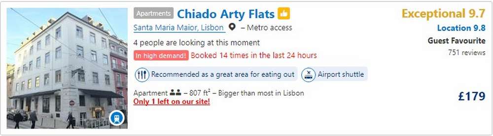
Booking.com do this effectively by adding bursts of red text to let users know when a hotel is in high demand. This makes visitors more likely to buy right there and then to avoid disappointment if they return later.
Make It Visible
I often talk to businesses about keeping important content ‘above the fold’ on their website. This is an old newspaper reference that basically explains that people’s attention is naturally drawn to the top half of a page – split by a fold. You should, therefore, focus on placing your CTA high on the page and in the centre, so it’s not hidden away.
More people are viewing content on mobile these days, putting CTA buttons or links at the top of a page is more important than ever. By making the call to action more visible, you’ll increase on-site engagement opportunities, which will result in increased clicks through to your target landing pages.
Test It, Then Test It Again
Once you have one CTA set up, don’t just sit back and relax. You should then test whether it is driving conversions and having a positive impact on your user engagement. There is no one size fits all for conversion rate optimisation and different audiences and sectors will have different needs and triggers.